I am an enthusiastic geospatial researcher currently pursuing the Erasmus Mundus Joint Master’s (EMJM) program, Copernicus Master in Digital Earth. My studies focus on Earth observation, geoinformation, and geovisualization. I am currently at Palacký University Olomouc, Czech Republic, specializing in Geovisualization and Geocommunication, and have completed my first year at Paris-Lodron University of Salzburg, Austria, where I focused on Earth Observation and Geoinformatics. I hold a bachelor’s degree in Urban and Regional Planning from Khulna University of Engineering and Technology (KUET), which provided a strong foundation in spatial data analysis and sustainable urban planning. I have hands-on experience in geospatial projects, working with ArcGIS Pro and QGIS to analyze spatial data and develop solutions for complex urban and environmental challenges
Palacký University of Olomouc, Czech Republic
Specializing in Geovisualization and Geocommunication
2025 - Present
Paris Lodron University Salzburg (PLUS), Austria
Specializing in Earth Observation and Geoinformatics
2024 - 2025
Khulna University of Engineering and Technology (KUET)
Focused on urban planning, remote sensing, spatial analysis and cartographic tools.
2017 - 2022
Worked on Remote Sensing-Based Mapping and Analysis of Landslides to Support Humanitarian Aid
Salzburg, Austria
Worked on Spatial data analysis, image interpretation, land use/cover classification maps preparation, cropping pattern extraction etc.
Dhaka, Bangladesh
Appointed to the “Mouza and Plot Based National Digital Land Zoning Project” which is carried out by the Ministry of Land.
Dhaka, Bangladesh
Exploring the intersection of geospatial technology and environmental analysis
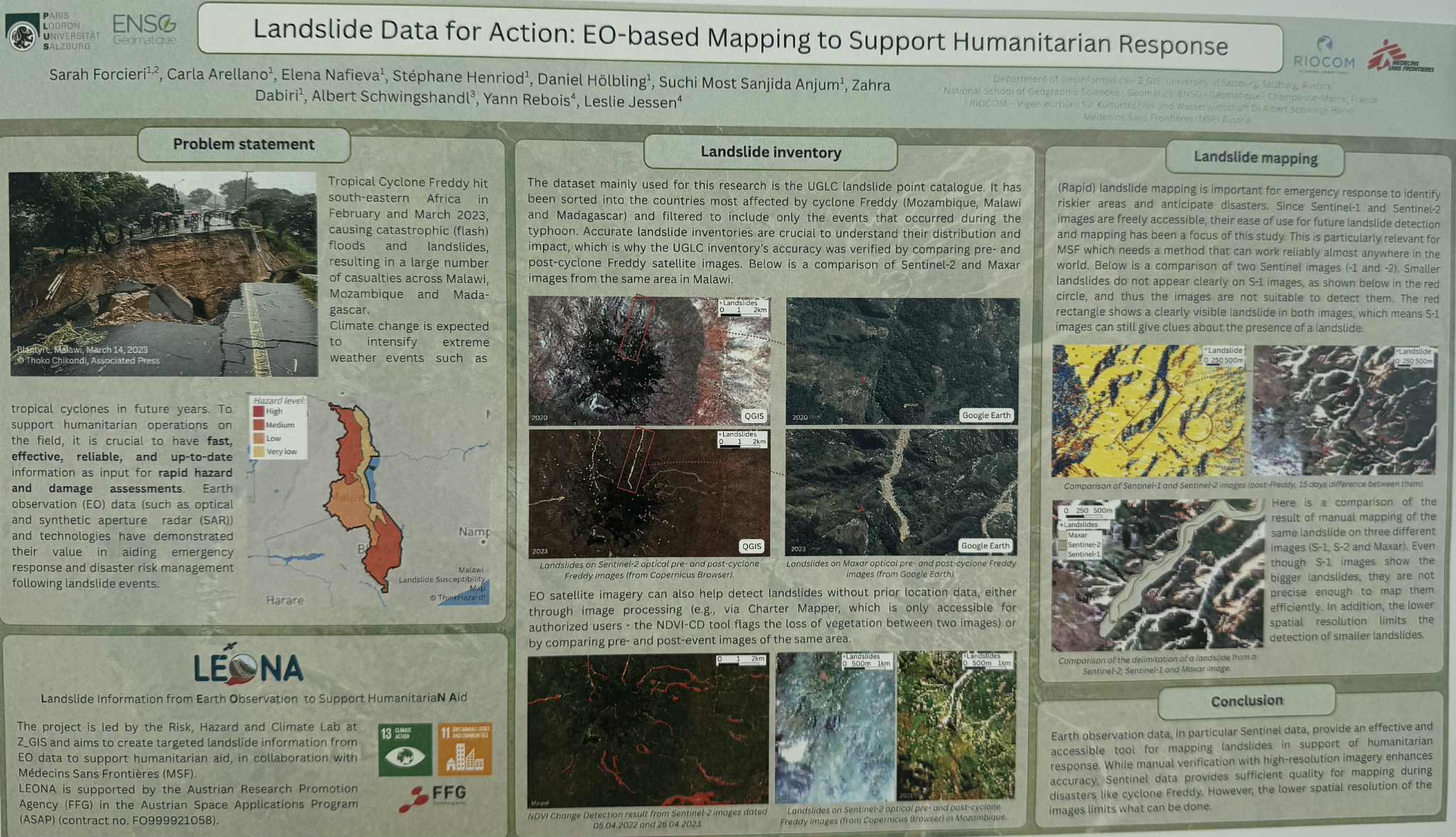
I completed a 12-week internship at Z_GIS within the Earth Observation and Natural Hazards Research Group, focusing on landslide mapping and disaster risk reduction in southeastern Africa (Malawi, Madagascar, Mozambique). The project addressed the impacts of Cyclone Freddy (2023), which triggered widespread flooding and slope failures.
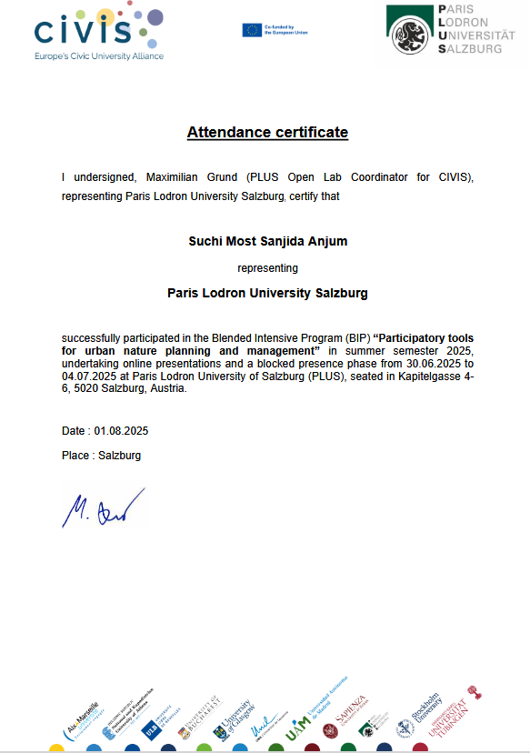
The BIP (Blended Intensive Program) titled "Participatory Tools for Urban Nature Planning and Management" was an interdisciplinary academic initiative focused on sustainable urban development through public participation. The program was structured in two parts: initial online classes and a week-long physical activity in Salzburg, Austria. The aim was to explore participatory methods and tools, including GIS-based applications, stakeholder engagement, and collaborative fieldwork.
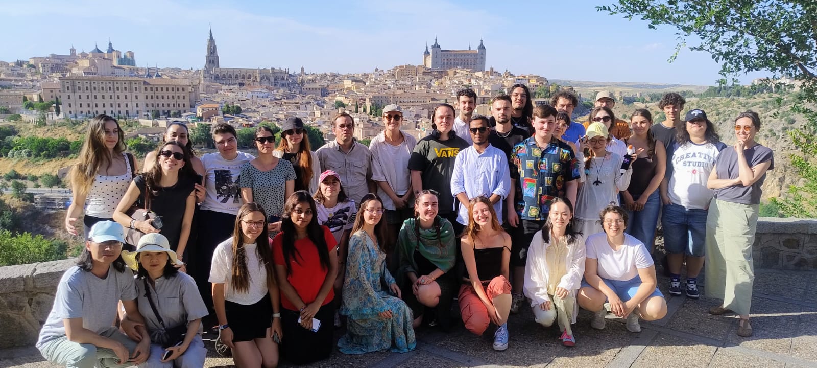
The BIP (Blended Intensive Program) titled "Overtourism in Global Cities: Impacts, Challenges and Solutions" was an interdisciplinary academic initiative examining the growing pressures of mass tourism on urban environments. The program was structured in two parts: preparatory online seminars and a week-long physical activity in Madrid, Spain. The aim was to analyse the social, environmental, and economic impacts of overtourism through fieldwork in Madrid's historic markets and a full-day excursion to Toledo, a UNESCO World Heritage city.
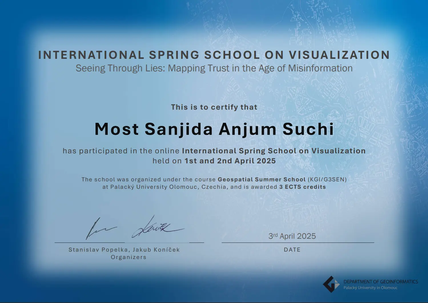
The International Spring School on Visualization (ISSonVIS 2025) was an intensive interdisciplinary program focused on the role of visual communication in the era of digital misinformation. Under the theme “Seeing Through Lies,” the course examined how spatial and data visualizations influence trust, and how visual storytelling intersects with ethics, perception, and the politics of information.
This project focuses on the creation of a topographic map of Olomouc, that highlights the area’s physical landscape and elevation patterns. The map uses contour lines and elevation-based color gradients to clearly represent variations in terrain, allowing major landforms such as mountains, highlands, and valleys to be easily identified.
This infographic visualizes the people and transport patterns of Dhaka city, highlighting mobility across its different divisions. The project combines data analysis with visual storytelling to create an accessible and engaging overview of urban mobility, demonstrating the potential of infographics to communicate complex urban dynamics effectively
I designed an unconventional ‘neon night’ map of Dhaka’s building footprints, highlighting the city’s urban structure in a visually striking way. By using bold neon colors against a dark background, the map transforms standard spatial data into an artistic, modern interpretation of the urban landscape.
This project assesses the tourism potential of the Balkan countries by analyzing tourist attractions and tourism infrastructure for 2022 using a multivariate approach. By combining multiple indicators such as sites of interest, accommodation facilities, and transport accessibility, the visualization identifies regions with high, medium, and low tourism potential.
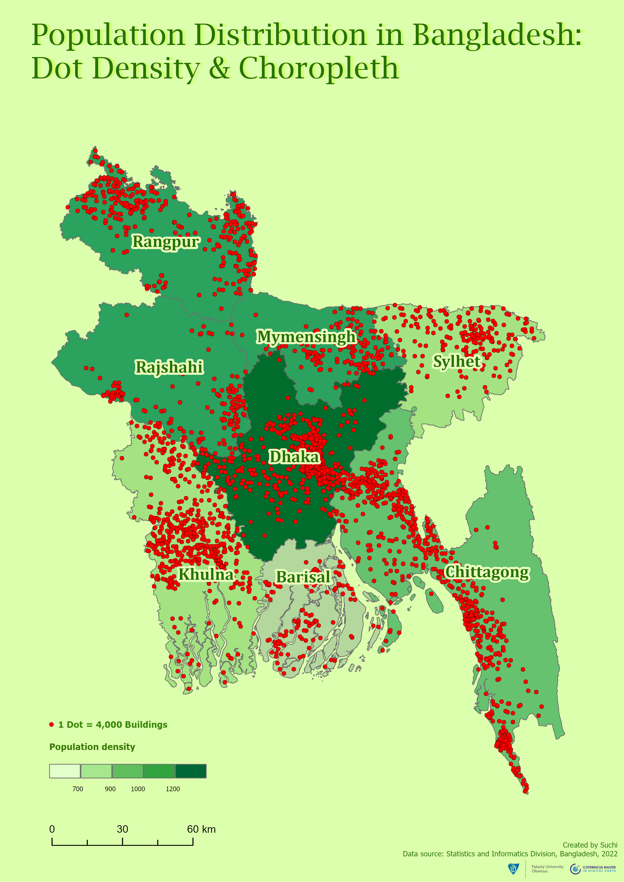
This project visualizes the population distribution of Bangladesh using both dot density and choropleth mapping techniques. The dot density map represents individual population units, providing a granular view of settlement patterns, while the choropleth map highlights population density across administrative regions.
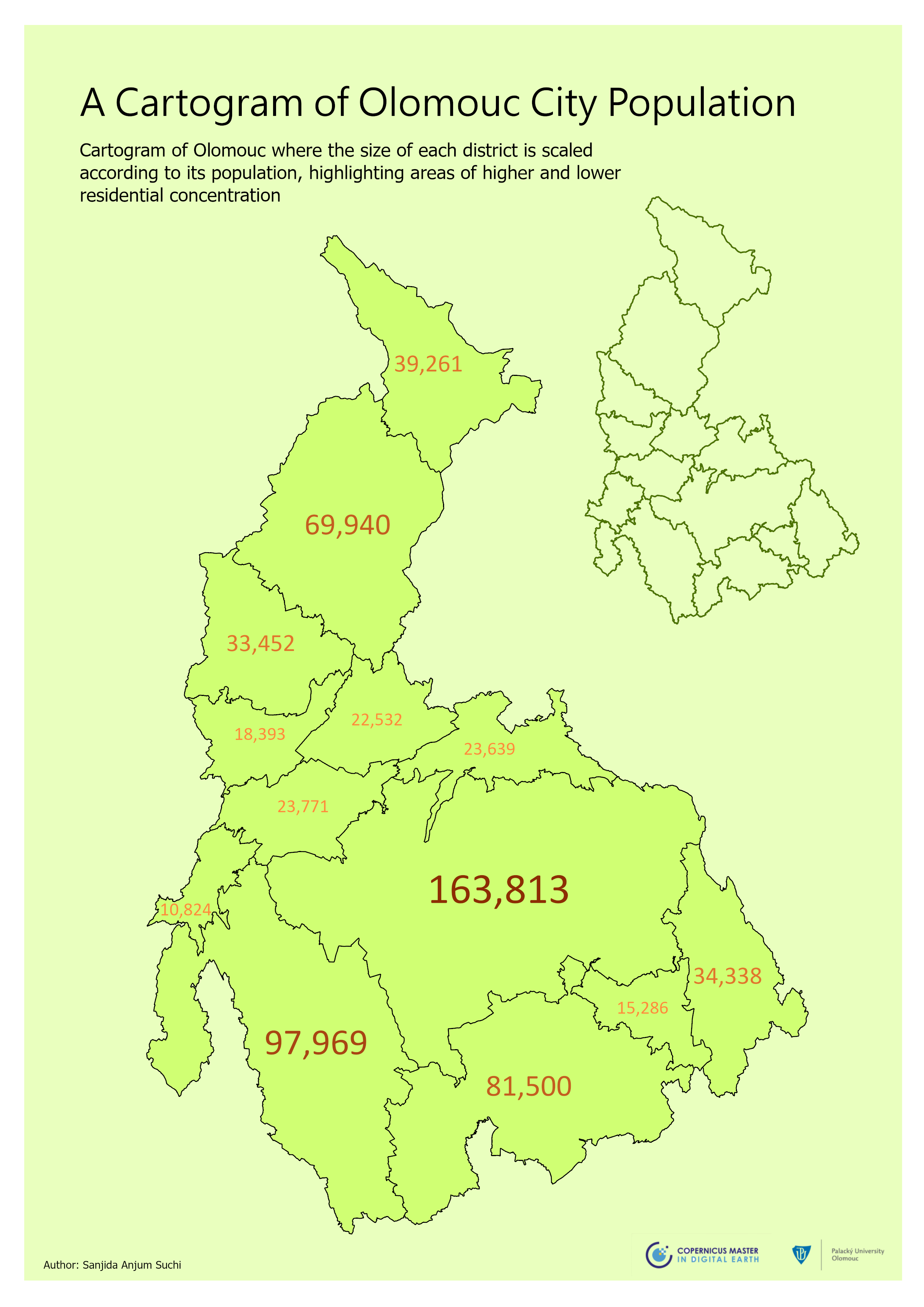
This project presents a cartogram of Olomouc, where each district is resized proportionally to its population. By scaling districts according to the number of residents, the map emphasizes areas of higher and lower population concentration, providing an intuitive visual representation of urban density and residential distribution across the city
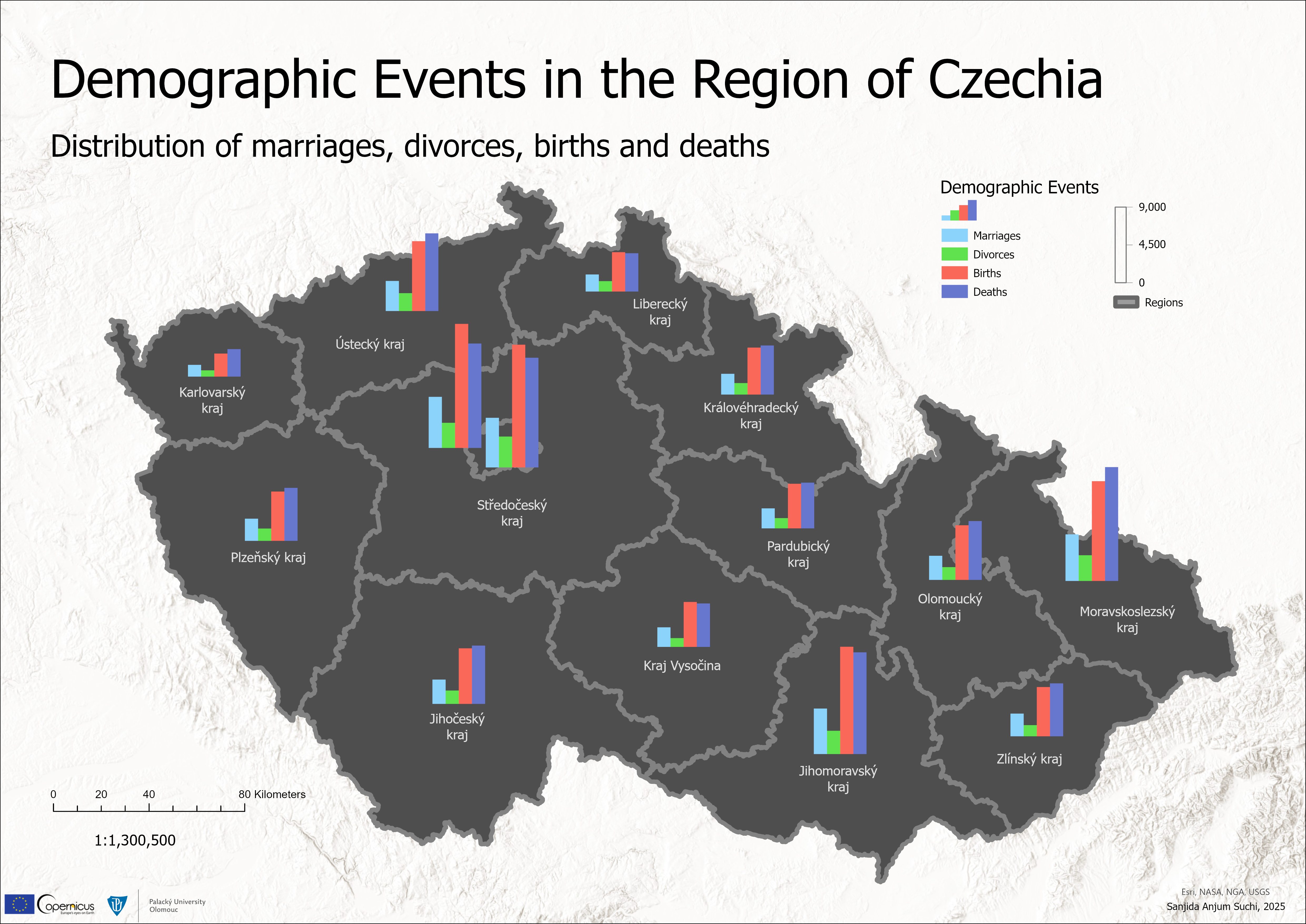
This project visualizes major demographic events in Czechia using chart based representations. The map presents the regional distribution of key indicators—marriages, divorces, births, and deaths through comparative charts, allowing patterns and differences between regions to be easily observed. The visualization highlights demographic dynamics and provides a clear overview of population changes across the country
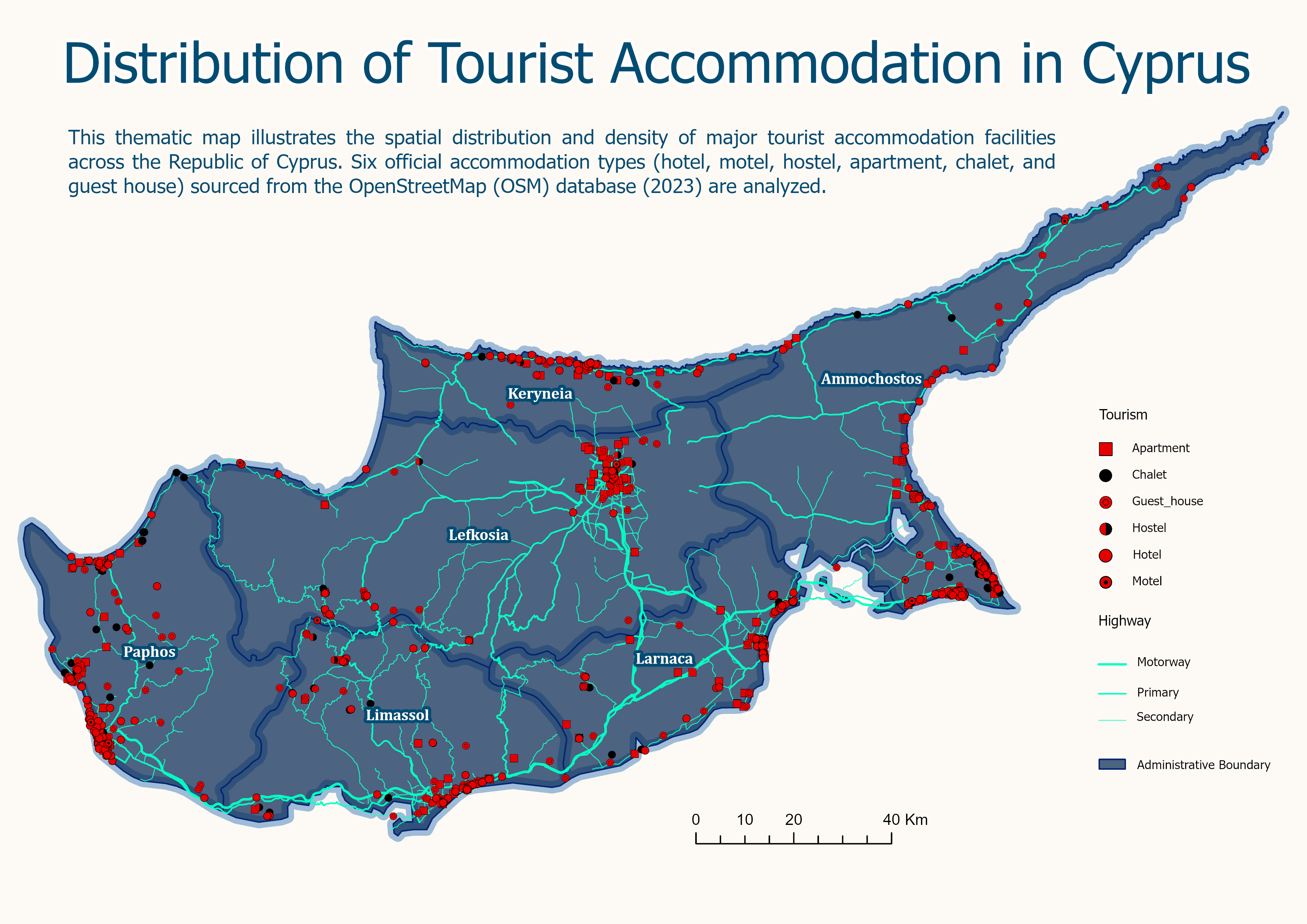
This thematic map shows the spatial distribution of major tourist accommodation types: hotels, motels, hostels, apartments, chalets, and guest houses across Cyprus. The data is derived from the 2023 OpenStreetMap database, highlighting key patterns and concentrations of tourism infrastructure on the island
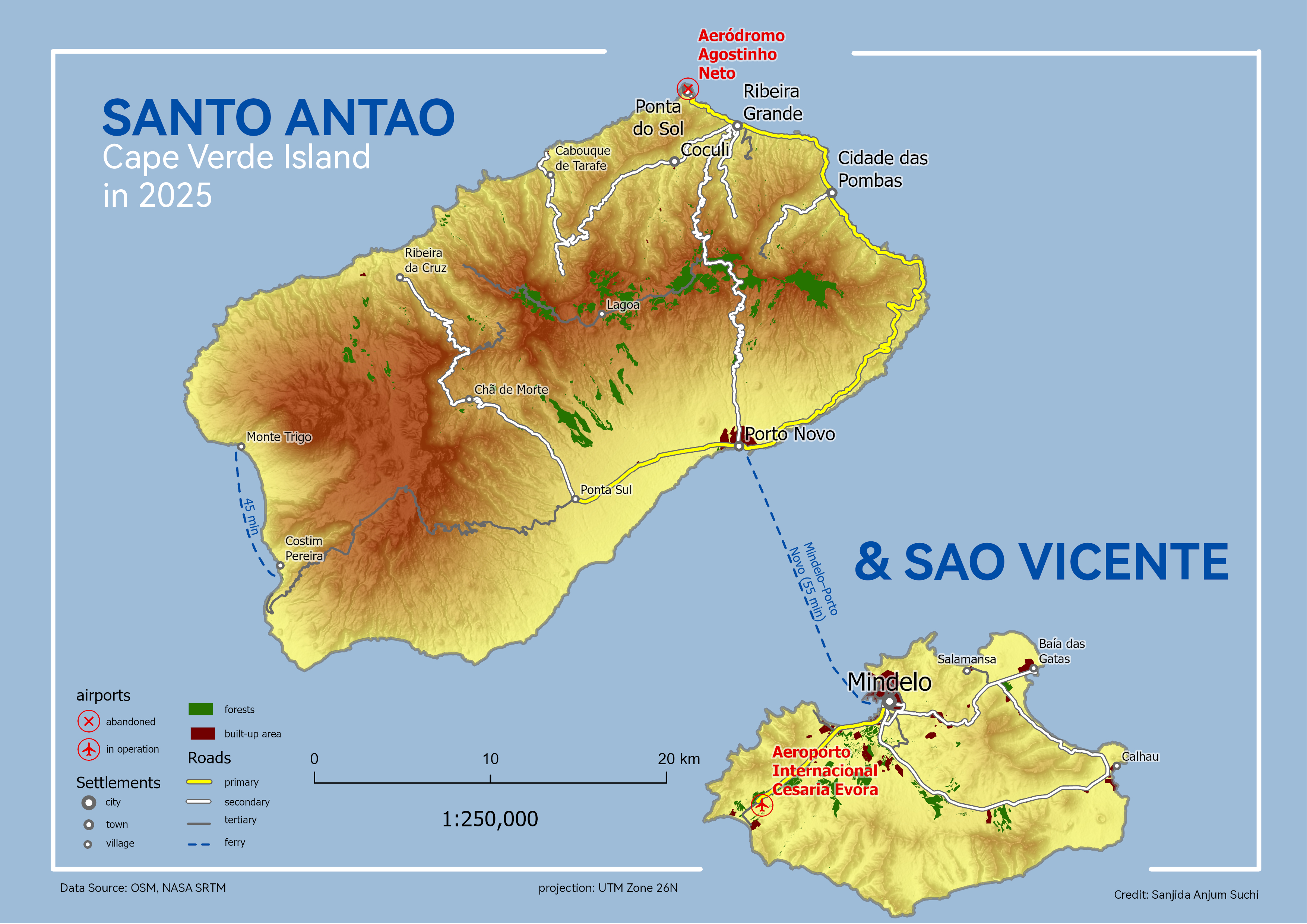
This project presents a map of Santo Antão and São Vicente, created for Principles of Geovisualization course. The map highlights key features such as airports, road networks, and settlements to illustrate spatial connectivity and human activity across the islands, applying clear symbolization and effective cartographic design principles
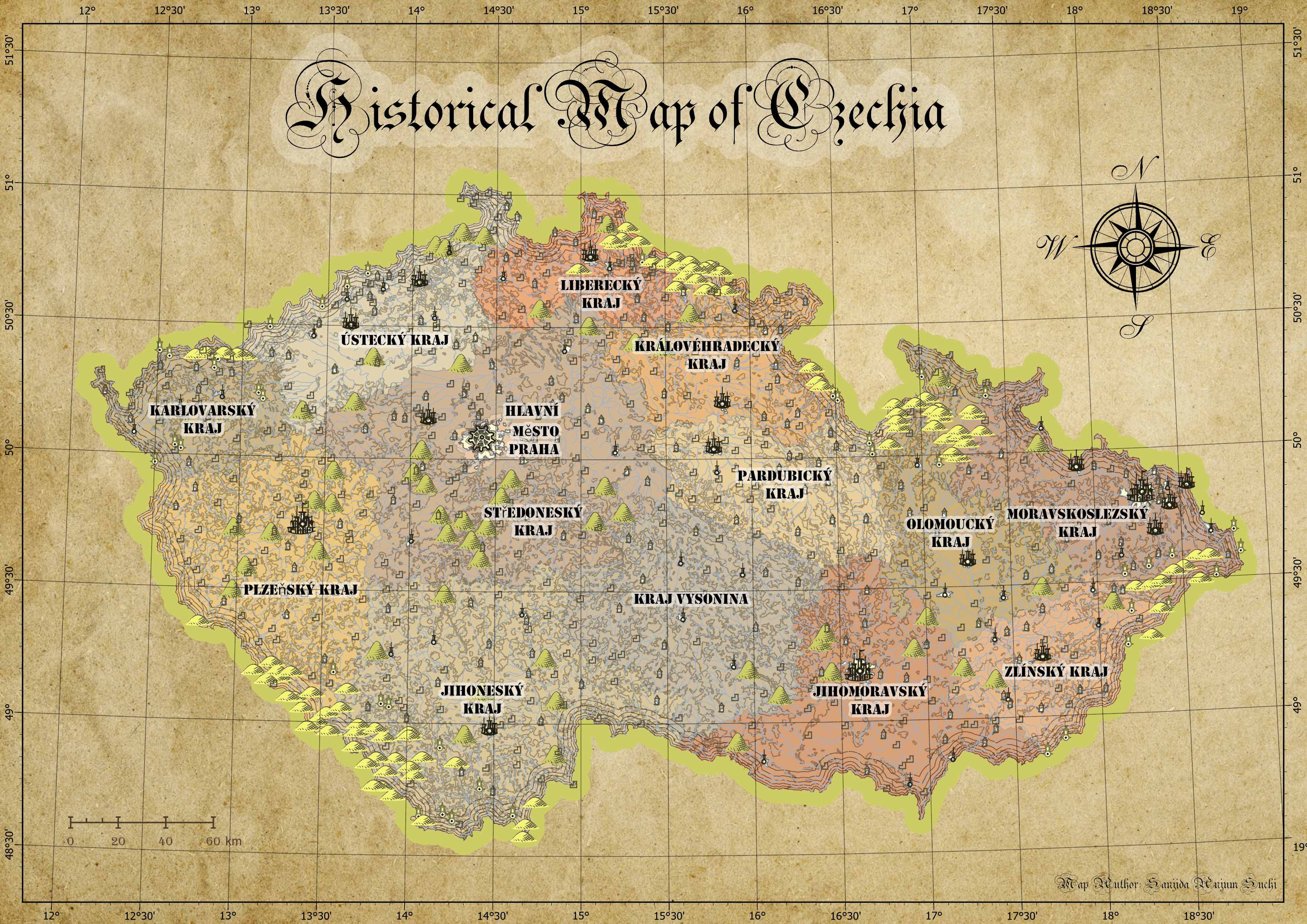
This project involved creating a historical map of Czechia with a focus on vintage cartography. Using ArcGIS, I explored historical design elements such as aged color palettes, classic typography, and period-inspired symbols to convey geographic information in a way that evokes the look and feel of traditional maps, while making the historical data accessible and visually engaging
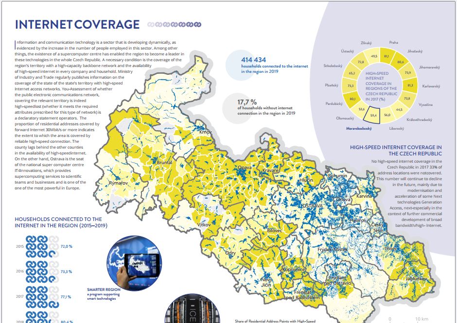
This infographic was developed as part of the Geovisualization course, focusing on the visual communication of Internet Coverage. I designed and produced the entire infographic using Affinity Designer, carefully integrating spatial data, graphical elements, and explanatory text to create a clear and engaging visual narrative.
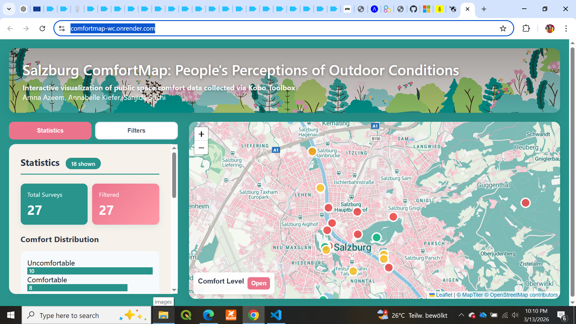
For our final project, we created Salzburg ComfortMap, an interactive web-based map designed to capture and visualize public perceptions of outdoor comfort in urban spaces. Data on thermal comfort and shading were collected using KoboToolbox and integrated into the map, allowing users to explore the results through interactive filters and view statistical summaries.
This project explores how Sentinel-1 (SAR) data can be used for flood monitoring and disaster analysis. The study reviews several Earth observation data portals and open-source processing tools used to access and analyze SAR imagery.
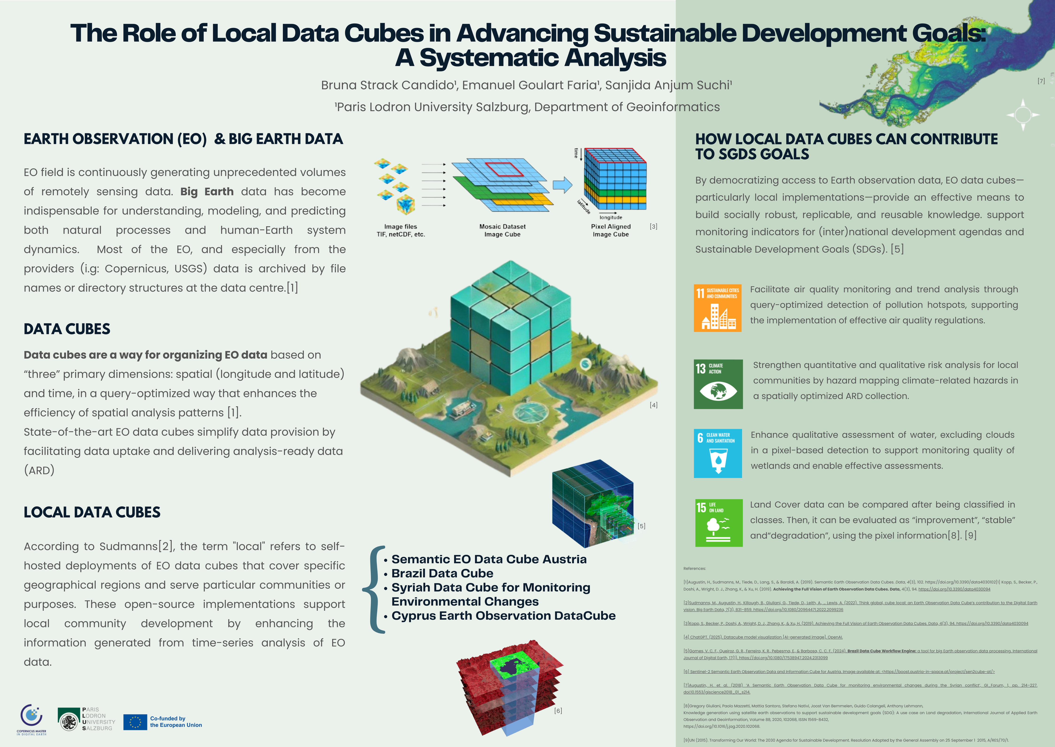
This poster explores how Local Data Cubes can support the monitoring and implementation of (SDGs) using Earth observation data. It demonstrates how scalable geospatial infrastructures enable efficient analysis of large satellite datasets for sustainability monitoring.
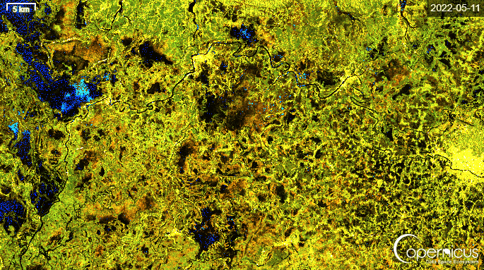
This analysis aims to identify urban areas, vegetation, and water bodies within Salzburg city using Sentinel-2 data. The application of custom scripts utilizing NDVI, NDWI, and NDBI provides valuable insights into the city's structure and its relationship with natural environments.
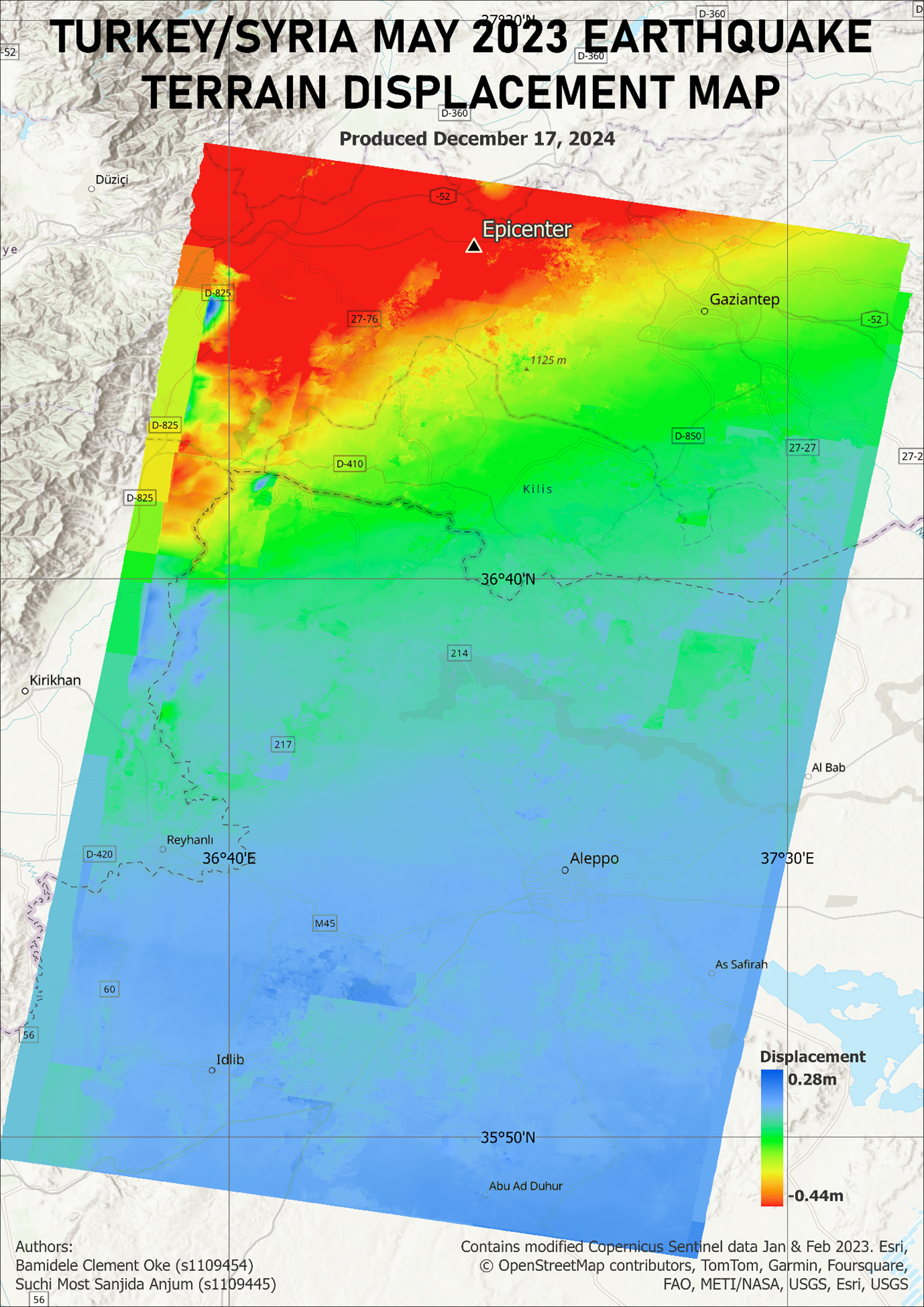
This project involved generating a high-resolution displacement map of the 2023 Turkey–Syria earthquake using Sentinel-1 SAR imagery. Pre- and post-event images were processed in SNAP, including sub-swath extraction, orbit file correction, interferogram generation, topographic phase removal, multilooking, and Goldstein filtering.
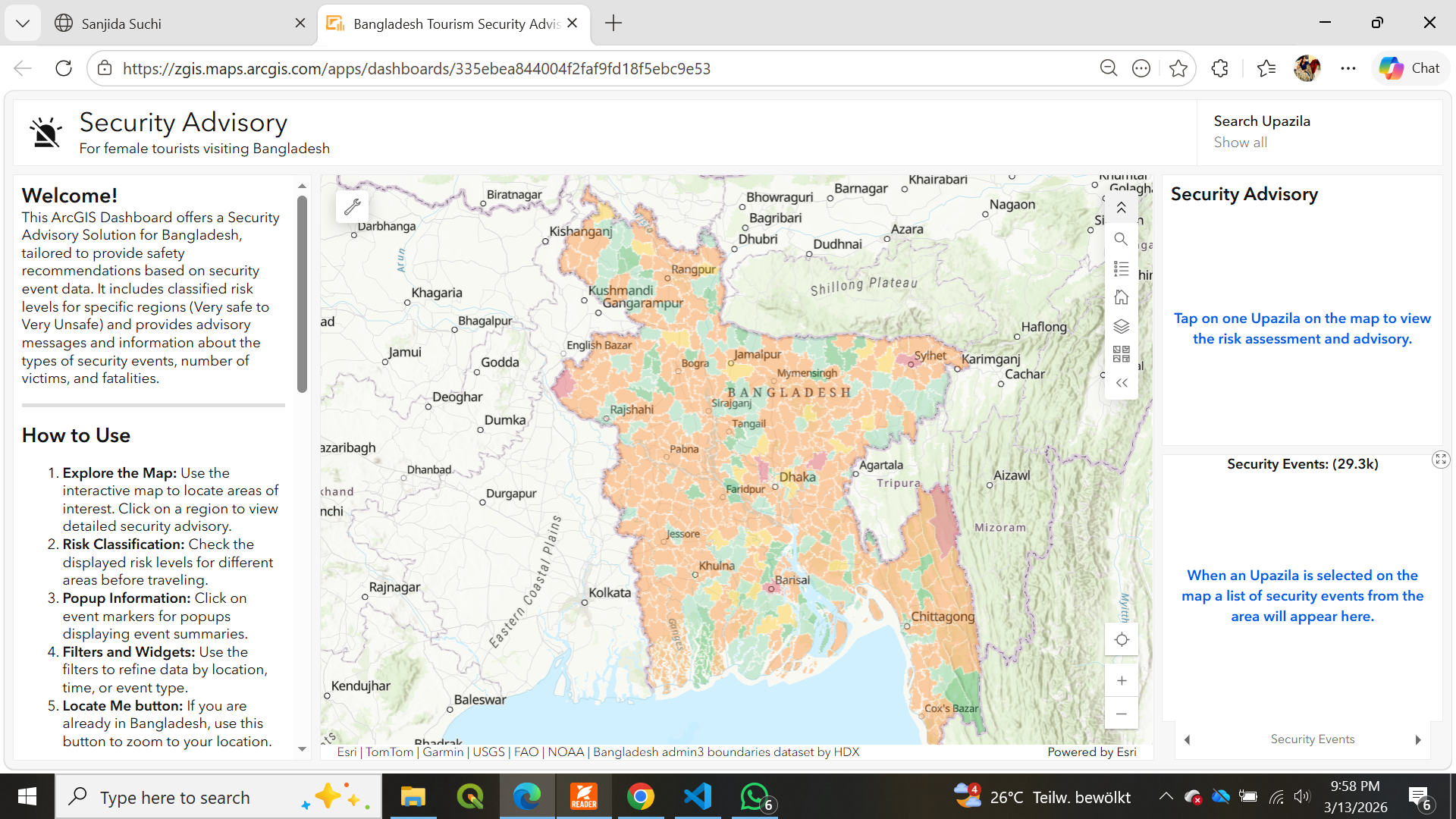
This project showcases an ArcGIS Dashboard designed as a Security Advisory Solution for Bangladesh, providing region-specific safety recommendations based on security event data.
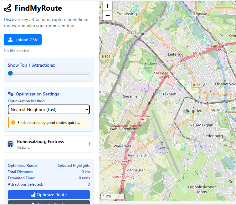
For the final project in Software Development (Python), our group created FindMyRoute, an interactive web map application to optimize travel paths in a city. We developed collaboratively in a shared GitHub repository, the project uses folium to visualize attractions and calculate efficient routes.
"This assignment focuses on evaluating and comparing image segmentation techniques in eCognition using Sentinel-2 satellite imagery. The goal was to determine which software provides more effective delineation of image objects for specific project needs. The study involved assessing segmentation outputs based on accuracy, efficiency, and suitability for object-oriented image analysis, and compiling the results into a comprehensive report.
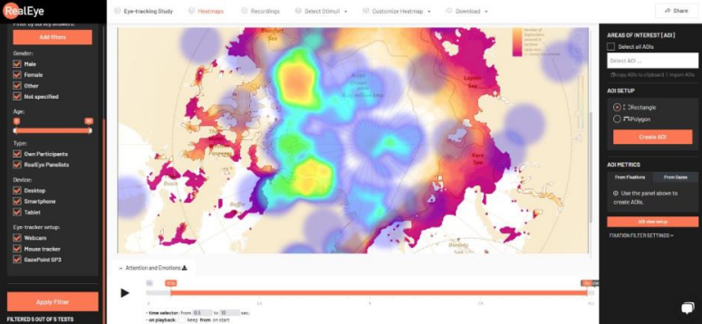
This study explores how viewers process and interpret maps depicting Arctic sea ice decline by analyzing their visual attention patterns using eye-tracking technology. By examining where and how long participants focus on specific map elements, the research aims to uncover insights into cognitive perception, map readability, and the effectiveness of visual communication in conveying critical climate change information
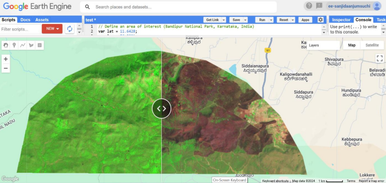
I conducted a temporal analysis of a forest fire event in Bandipur National Park, India, using Sentinel-2 imagery on the Google Earth Engine platform. By comparing pre- and post-fire images (20–25 February 2019) with cloud masking and band selection, I assessed vegetation changes and identified significant vegetation loss in the affected areas
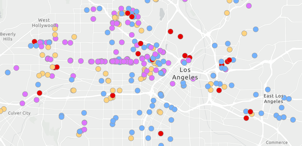
The dashboard will feature a map of medical facilities in Los Angeles County and include interactive chart and list elements. These components work together to provide a dynamic and user-friendly visualization of healthcare data in the area. The completed dashboard demonstrates how location-based analytics can be used to explore and analyze data effectively.
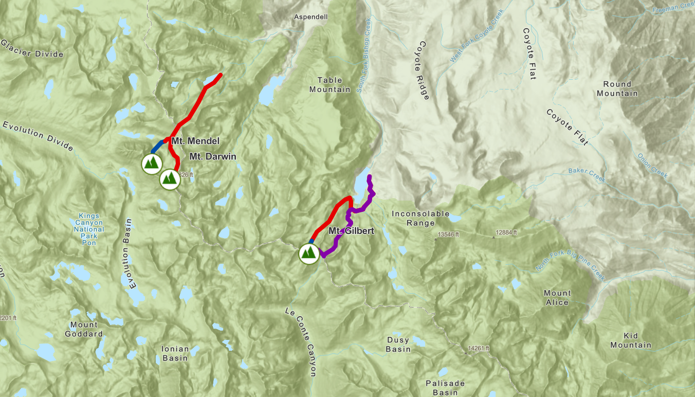
Explore snow and ice climbing routes in the Sierra Nevada Mountains through this interactive web app. The map features filtering capabilities by route type, allowing climbers to visualize and prepare for their preferred climbing experiences. Using ArcGIS Instant Apps with Interactive Legend template, users can easily navigate and discover routes that match their interests and skill levels. The app also offers a 3D viewing option to explore routes in a three-dimensional environment.
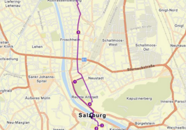
Explore Salzburg's rich cultural heritage through our interactive map featuring historical landmarks, museums, viewpoints, and accommodation options. From Mozart's birthplace to the Hohensalzburg Fortress, discover the city's most beloved attractions. The map includes various categories like museums, galleries, hotels, hostels, and scenic viewpoints to help plan your perfect visit to this UNESCO World Heritage city.
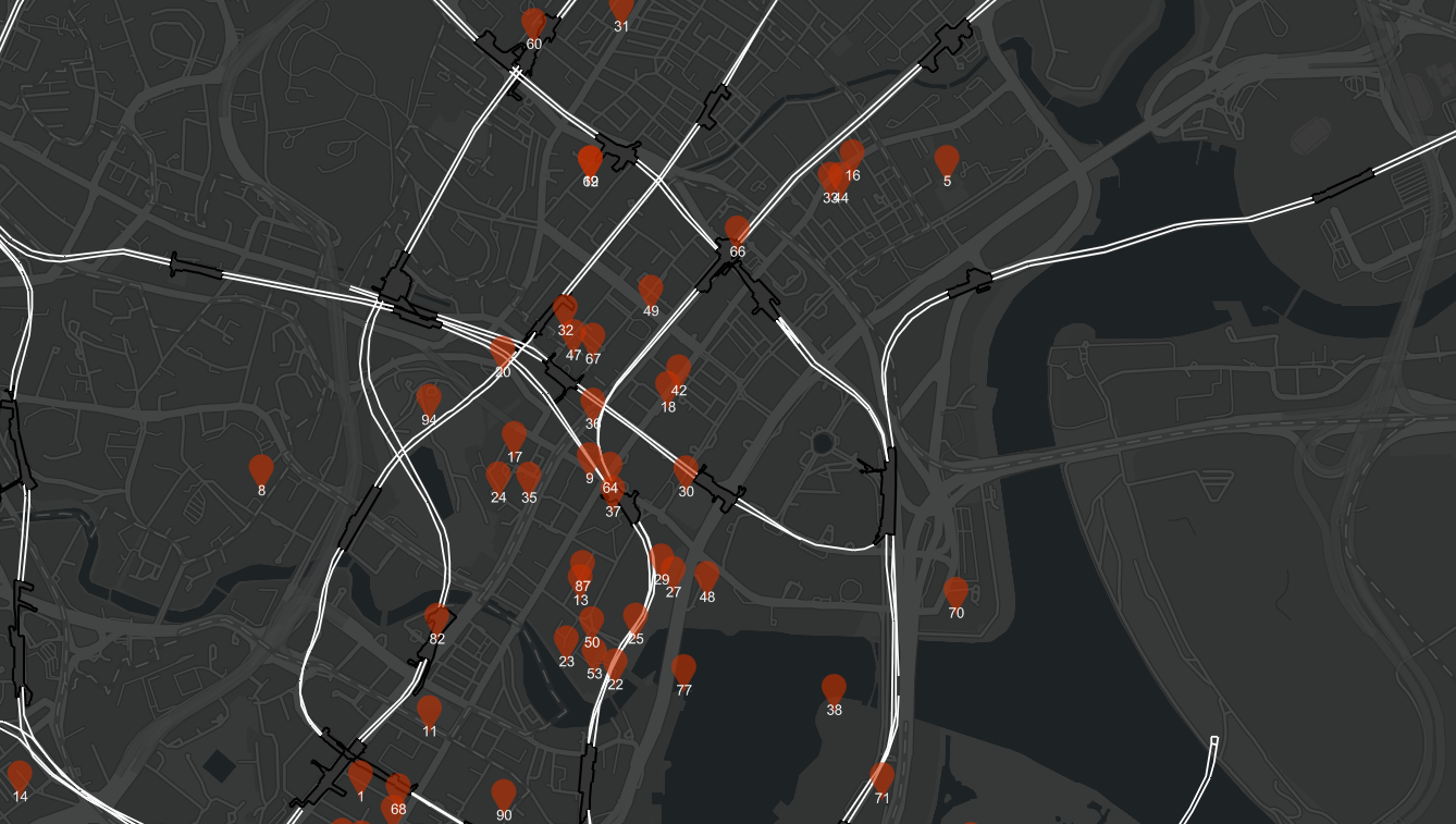
The map displays numerous orange icons scattered throughout the district, likely representing various tourist attractions. The map also shows the rail network within the district, with lines represented by thin black lines and stations marked with small circles. This information is useful for tourists who plan to use public transportation to get around Central Business District
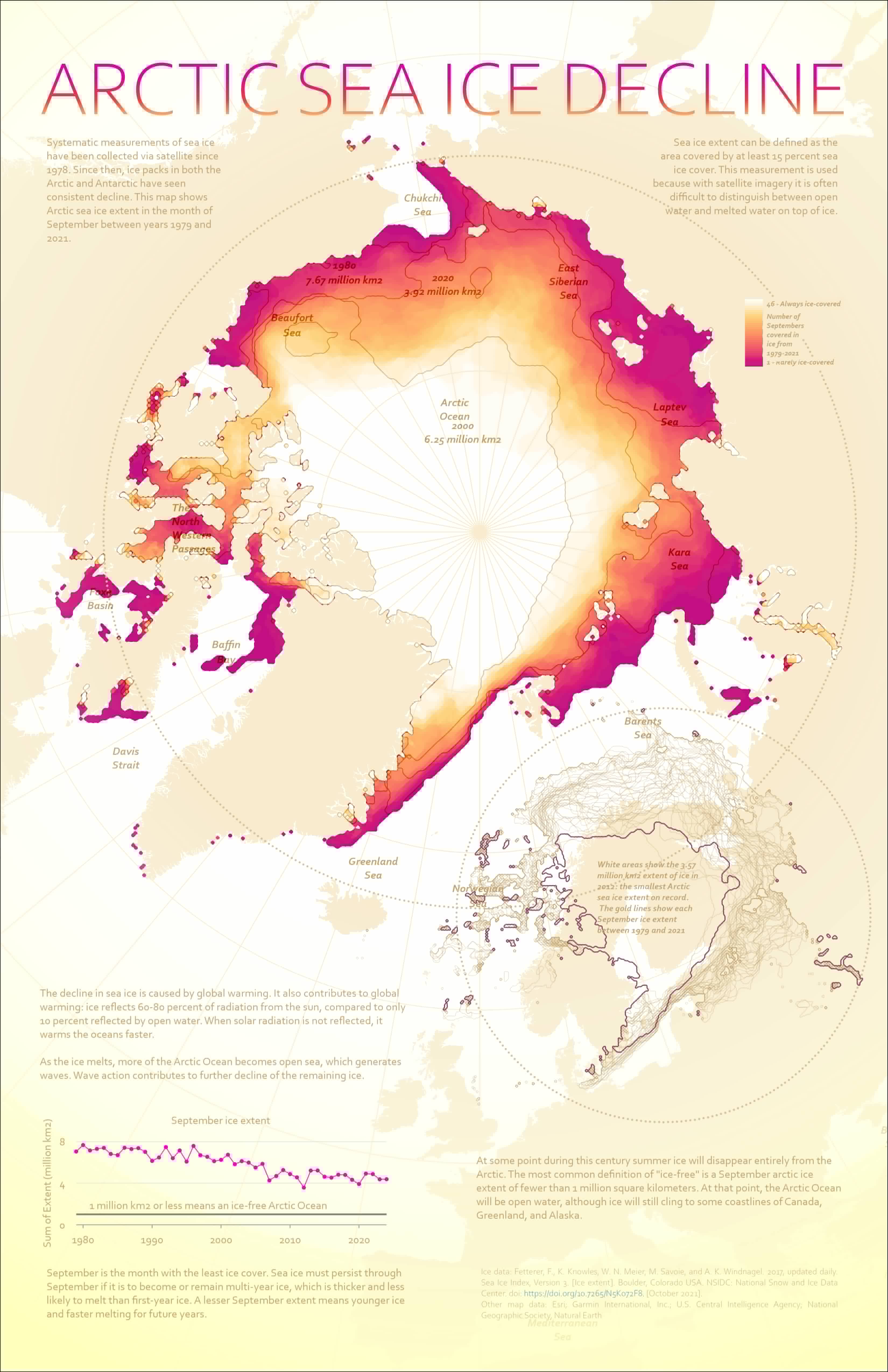
Experienced in cartographic design using ArcGIS Pro, including mapping Arctic sea ice, refining symbology, labeling, creating map layouts, and designing inset maps. Skilled in transforming spatial data into clear, visually appealing maps. Able to integrate data analysis with design principles to communicate complex spatial information effectively to diverse audiences
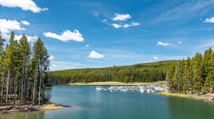
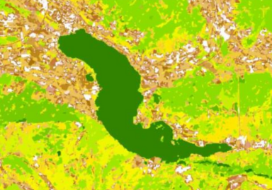
Discover the stunning seasonal transformations of Yellowstone Lake, the largest high-elevation lake in North America. Whether it's the awakening of spring, the vibrant summer, the golden hues of fall, or the serene calm of winter, Yellowstone Lake offers breathtaking views and unforgettable experiences throughout the year.